Showing posts with label Tableau. Show all posts

Thursday, 31 March 2016

Magnificent Mahrez?

Central to Leicester City's rise from almost-certain relegation in the 2014/15 Premier League season, to almost-certain title winners in the 2015/16 Premier League season, has been Riyad Mahrez. Not only is that a shocking sentence to have composed, it's also shocking just how much impact Mahrez has actually had. With 16 goals and 11 assists in the league this season, he has been a revelation.

And just to continue with that 'shocking' theme, he was plucked from the relative obscurity of Le Havre in France's Ligue 2 for a mere £400,000. For that amount, you could probably buy Cristiano Ronaldo's big toe. I extracted some data from www.whoscored.com (sadly not about Ronaldo's toe), to see just how his contribution measured up to some of Europe's leading lights in the Attacking Midfield positions.

For this visualisation I've only looked at Assists and Goals, because there's a whole myriad of different ways to measure, I didn't want to get too bogged down in that just yet, despite how interesting it may be. One pick that I didn't bring through was that of the 32 players I selected, Mahrez ranks 26th for average passes per game. So despite seeing less of the ball than his contemporaries, he seems to do an awful lot more with it.

But I digress, and to the viz - I'll let you judge for yourself who it reflects well and badly upon...


Thursday, 14 January 2016

Gun Crime in The USA - Just the last 72 Hours

So, I'd heard a few stats about the number of gun-related deaths in the US since the turn of the year and thought I'd look for some data on that. What I actually found only covers the last 72 hours, but is still quite staggering (to me at least, in the UK):


Monday, 11 January 2016

Can Money Buy You Love in the Top 5 Leagues in Europe?

First and foremost, welcome to 2016 - I hope you all have a prosperous, fun and exciting new year! 2015 was a great year for me, escaping an employer that was seemingly content to stop investing in staff development, into a new role with a new employer where the entire culture is focused on development. A refreshing change, but enough about me - let's talk data.

The data for this post comes from the Football Observatory in Switzerland, and the idea came about after I saw them featured in the Independant, looking at the top 100 valuable players in Europe. I delved around on their site and found data that had tracked the transfer fees spent on current squads for all teams in the top 5 leagues in Europe.

Naturally I wondered how those transfer fees had translated into points and league positions. The results of that curiosity can be found in the storyboard visualisation below. A couple of great finds came out of it:


  1. Obviously Leicester are tearing up trees in the Premier League, but across the Channel, Angers and Caen are moving mountains on their shoestring budgets. So small has their transfer outlay been, the Football Observatory rounded it up to 'Less than 5 million Euros'. So the actual numbers are probably less than displayed.
  2. Also Chelsea have been at the centre of attention for failing so miserably this season, but don't let that detract from Newcastle, Sunderland and Aston Villa. Their poor seasons have not gone unnoticed but perhaps the cost of their squads has at £123m, £102m and £98m they are ranked 19th, 25th and 26th in Europe respectively on that score. Pretty shocking!

Tuesday, 3 November 2015

Road Traffic Accidents: London 2005 - 2014

I think this will probably be my last viz for a while using this particular set of data. It's an incredibly useful dataset for honing your Tableau skills so I'd certainly recommend it. Downloaded from data.gov.uk and processed using Alteryx to join three datasets together (Accidents, Casualties and Vehicles) you get about 5 million rows and an awful lot of map points.

For that reason you really need to filter it down to stop everything grinding to a halt (though this sounds like a future challenge potentially). So, I took the most instantly recognisable city in Europe, maybe the world, and plotted all RTAs within the Metropolitan Police jurisdiction. Note City of London is empty. I assure you, cars can crash there, it's just they have their own separate police force.

Anyway, to the viz!


Wednesday, 26 August 2015

Shooting for the Stars (But Missing Quite Often)

You may have noticed that this has become a bit of a Football stats blog of late, but with the new season just three games old, a whole plethora of data available and some new toys to play with, I think it'd be rude not to!

The latest dataset comes courtesy of www.football-data.co.uk, it's a relatively straightforward set of data containing standard high level data on matches played so far this season. The format it's in doesn't really lend itself to much analysis though, so my favourite new toy - Alteryx - helps me prep the data in ridiculously quick time.

The raw data gives one row per match, dividing the team data into 'Home' and 'Away'. So if I want to aggregate all data relating to Chelsea, it becomes a bit difficult, as they essential have two fields for each statistic, as well as two fields for their actual name. Using Alteryx I split out the 'Home' and 'Away' team data, cleaned it up, renamed the headers to match and used the Union tool to append the 'Away' data to to the end of the 'Home' data. The finished workflow is remarkably simple:


I'm bringing the data in, using the Record ID tool to assign each match a unique ID, using the Select tool to pick up the 'Home' fields only, and another for the 'Away' fields where they are renamed to match, then using the Union tool to put them back together again, using two Formula tools I'm adding a new field called 'Season' and with the second I'm setting up a field called Result and populating it before outputting the data. Easy.

All I needed to do now was import it into Tableau Public and see what I could find:


Thursday, 20 August 2015

My First Webscrape - Premier League Player Ratings 2014/15

A couple of things led to the creation of this visualisation - a couple of colleagues and I are attempting to build models predicting the outcome of every Premier League match this season, with varying degrees of success, and secondly I saw Chris Love's awesome scrape of the BBC live text data. That got me thinking, if that complete mess of data can be scraped, anything can.

At first I tried to use the Alteryx Download and JSON Parse tools in a similar way to Carl at The Information Lab, but I'm a complete novice and couldn't get it to work. Definitely running before I can walk. But fortunately enough, I stumbled upon Data School student Hashu Shenkar's post on using Import.io in conjunction with Alteryx. I'd used Import.io before, but wasn't really aware just how powerful it could be - Hashu's post opened my eyes to what it could do.

I wanted to scrape Whoscored.com's Player Summary data, club-by-club for last season, for clubs who are currently in the Premier League (so we exclude QPR, Hull & the other one who got relegated) and include Norwich, Watford and Bournemouth's Championship stats (you can highlight and filter their data if you are against comparing apples with pears). I soon realised that WhoScored isn't the easiest to scrape from, but managed to get the Summary data, after about 8 attempts - for reasons unbeknown to me, when I published my API and ran my block list of 20 URLs through it, some would fail. I then had an issue where the API was skipping over players who were transferred out, such as Christian Benteke.

Anyway, data all downloaded I put it into Alteryx to clean it up, get rid of repeated fields, weird characters and organise it ready for Tableau. I'm currently evaluating Alteryx for a couple of weeks so I thought what better way to ease myself into it? The raw data scraped using Importio included Player Position data (as you'll see in the viz) in this kind of format: AM(RLC), FW. So I created a workflow in Alteryx to break that down into Individual positions: AMR, AML, AMC and FW with one row per player per position.

Once that was done, I had two csv files ready for Tableau Public!

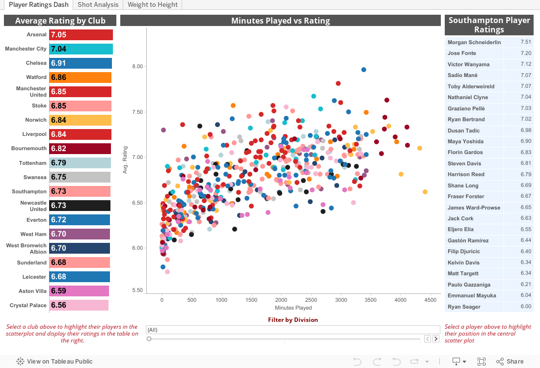
Within this data there's a lot of insight to be gained, all sorts of interesting little stats hidden away and patterns emerge pretty quickly. I particularly enjoy how Chelsea's players are split in to two clusters, rating-wise, probably the only team aside from AFC Bournemouth, who have a clearly defined starting 11 with minimal rotation. That served them well last season, but with the increased competition in the PL and the step up for Bournemouth, is it unrealistic to expect that same approach to work for both teams this season? No doubt we'll find out.

One final point, WhoScored also have separate tabs (Javascript I believe) for offensive, defensive and passing statistics, but try as I may, I couldn't get import.io to scrape from those - any tips on how to do that would be most welcome. Enjoy the viz, was great fun making it from start to finish.

As usual, everything is interactive so click away and see what you can find. On the second tab, I've picked out some stats that caught my attention.


Friday, 6 February 2015

The Viewing Figures Visualisation

Inspired by DataJedi.ninja's fantastic 'Previously on 24' viz from last year, I thought I'd take a look at The Big Bang Theory following on from the stars of the showing reportedly earning themselves a $2m paycheck per episode - not bad work, if you can get it!

The Viz below shows how the viewing figures have changed over time, from the lows of Series 1 through the highs of Series 6 and 7. Enjoy :)

Also noticed this viz really shows off the new and improved tooltip functionality - much slicker transitions whilst hovering...

Thursday, 22 January 2015

UK Road Accidents v3 - The Horizontal Scroll!

A few months back I started up a little bit of a project with a pretty hefty data set on the data.gov.uk site. The data relates to all recorded Road Traffic Accidents in Mainland Britain from 2005 to 2013. That's a heck of a lot of records, and Tableau Public 'only' allows for 1 Million. I decided to go from 2010 onwards to get a smaller, yet sizeable sample of data to experiment with Tableau Public and push some (of my) limits.

I hadn't really looked at it for a while until I saw a bit of a Twitter exchange between two immensely talented Vizzers (is that the right word?):

And that set me thinking half jokingly about scrolling the other way. The next tweet sealed the deal for me though:

Now  I had the image of the user scrolling through a viz by swiping across - and that brought me back to the Road Traffic dataset, perfect! The viz is below, decided against restricting the Tableau embed width as you need to go off screen to scroll otherwise.

Anyways, less fluff, more viz:


Friday, 27 June 2014

Everyday Sexism

I've noticed a fair amount of people using the #EverydaySexism hashtag of late on Twitter, and quite a lot of the stories being told both on Twitter and on the Everyday Sexism website are pretty shocking. I thought I'd have a look to see just how popular this tag is, and where in the world people are tweeting in from. It's the first time I've ever harvested data from Twitter, so it's a little basic at the moment. Baby steps!


Saturday, 5 April 2014

Property Sales in England - January 2014

The data people over at data.gov.uk publish figures from the Land Registry looking at 'Price Paid' on every Residential property. So far, they are up to January 2014 and the visualisation below really rams home the difference in the property market between London and the rest of England at least.

In January alone there were 3,663 properties sold at a total value of £1.9bn in the Greater London area, whereas the totals for all of England came in at 25,476 properties sold at a total value of £6.6bn. So whilst London only accounts for 14% of all sales, it accounts for around 29% of the value!

The most expensive property in January fetched a remarkable £13m (in London somewhere!) whilst the cheapest was just £11k. Not sure where that was, but I'll definitely have to find out!

The data provided by data.gov is pretty extensive, so I'll be playing around with it a little more in the near future. Also the data has been collected since 1995 so it might be interesting to do a bit of trend analysis on that. In the meantime though, enjoy: