
Friday, 2 June 2017
The Paris Agreement
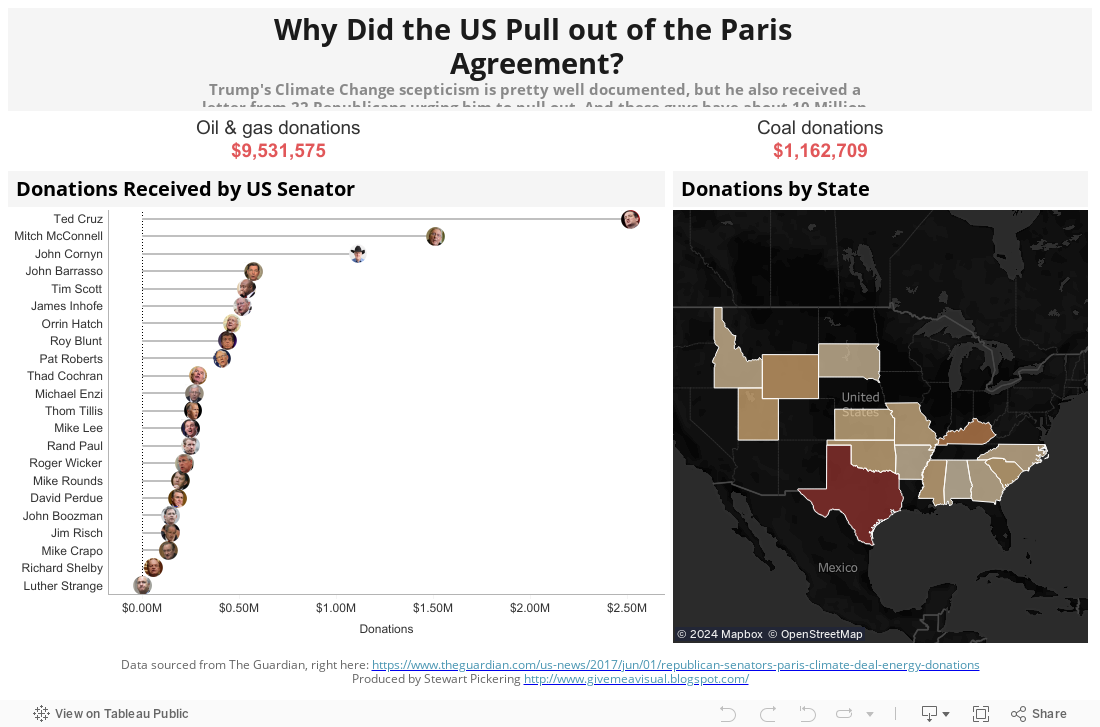
As reported in The Guardian, 22 Republican Senators signed a letter addressed to Donald Trump urging him to pull out of the Paris Agreement. The Guardian also provided some numbers, so here’s a Viz looking at the 10 Million reasons why this may be of benefit to them…

Thursday, 31 March 2016
Magnificent Mahrez?
Central to Leicester City's rise from almost-certain relegation in the 2014/15 Premier League season, to almost-certain title winners in the 2015/16 Premier League season, has been Riyad Mahrez. Not only is that a shocking sentence to have composed, it's also shocking just how much impact Mahrez has actually had. With 16 goals and 11 assists in the league this season, he has been a revelation.
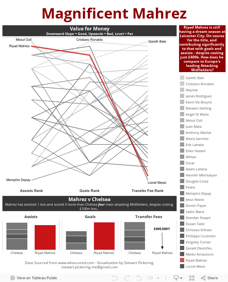
And just to continue with that 'shocking' theme, he was plucked from the relative obscurity of Le Havre in France's Ligue 2 for a mere £400,000. For that amount, you could probably buy Cristiano Ronaldo's big toe. I extracted some data from www.whoscored.com (sadly not about Ronaldo's toe), to see just how his contribution measured up to some of Europe's leading lights in the Attacking Midfield positions.
For this visualisation I've only looked at Assists and Goals, because there's a whole myriad of different ways to measure, I didn't want to get too bogged down in that just yet, despite how interesting it may be. One pick that I didn't bring through was that of the 32 players I selected, Mahrez ranks 26th for average passes per game. So despite seeing less of the ball than his contemporaries, he seems to do an awful lot more with it.
But I digress, and to the viz - I'll let you judge for yourself who it reflects well and badly upon...
Wednesday, 3 February 2016
Steven Fletcher - Marseille's New Goal Machine?
You know it's been a boring transfer deadline day when the biggest shock is the completely left-field loan signing of Steven Fletcher. No offence to the guy, but amongst the other names touted for a move he doesn't exactly set the pulses racing.
There are a few reasons it has surprised me:
There are a few reasons it has surprised me:
- Marseille play with one striker, and he's unlikely to displace Michy Batshuaiyi from the starting line up, or play alongside him very often
- His biggest strength lies when the ball is in the air - so why have Sunderland, scrapping away at the bottom of the table let him go? You'd assume he could strike up a good partnership with Defoe, plucking the ball out of the air and feeding it in to the little man.
- He's a striker not renowned for his goalscoring prowess - 6 of his 8 international goals for Scotland have been scored against Gibraltar.
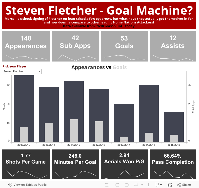
Anyway, I raided Whoscored.com for some stats and compared him to a couple of other attacking players from the Home Nations (England, Wales & Republic of Ireland) - I intended to inlcude Northern Ireland, but their main striker plays only slightly more top flight football than I do, thus rendering any comparion completely pointless (as opposed to only slightly pointless for the rest).
Fletcher doesn't really fit in with Marseille's current style of play, so I think their thought process in signing him is to lump the ball into the box late on in matches where they're drawing or losing. It's a ploy that could well work.
Fletcher doesn't really fit in with Marseille's current style of play, so I think their thought process in signing him is to lump the ball into the box late on in matches where they're drawing or losing. It's a ploy that could well work.
The visual gives you an overview of a few keys stats from the past 6 seasons, and lets you choose which player to look at. There are sparklines beneath each stat, so you can view the trend in each area:
Wednesday, 20 January 2016
Midweek Makeover
So, I saw a visualisation on the BBC Sport website, looking at Rafa Nadal's Grand Slam career performance after his first round knock-out at the hands of Fernando Verdasco. Looking at it, it's fairly straightforward to read, but it just doesn't look right - it felt as though they'd used the wrong type of chart to visualise this data. So I thought I'd attempt to make it over, see if I could do any better. Judge for yourself!

Thursday, 14 January 2016
Gun Crime in The USA - Just the last 72 Hours
So, I'd heard a few stats about the number of gun-related deaths in the US since the turn of the year and thought I'd look for some data on that. What I actually found only covers the last 72 hours, but is still quite staggering (to me at least, in the UK):

Monday, 11 January 2016
Can Money Buy You Love in the Top 5 Leagues in Europe?
First and foremost, welcome to 2016 - I hope you all have a prosperous, fun and exciting new year! 2015 was a great year for me, escaping an employer that was seemingly content to stop investing in staff development, into a new role with a new employer where the entire culture is focused on development. A refreshing change, but enough about me - let's talk data.

The data for this post comes from the Football Observatory in Switzerland, and the idea came about after I saw them featured in the Independant, looking at the top 100 valuable players in Europe. I delved around on their site and found data that had tracked the transfer fees spent on current squads for all teams in the top 5 leagues in Europe.
Naturally I wondered how those transfer fees had translated into points and league positions. The results of that curiosity can be found in the storyboard visualisation below. A couple of great finds came out of it:
- Obviously Leicester are tearing up trees in the Premier League, but across the Channel, Angers and Caen are moving mountains on their shoestring budgets. So small has their transfer outlay been, the Football Observatory rounded it up to 'Less than 5 million Euros'. So the actual numbers are probably less than displayed.
- Also Chelsea have been at the centre of attention for failing so miserably this season, but don't let that detract from Newcastle, Sunderland and Aston Villa. Their poor seasons have not gone unnoticed but perhaps the cost of their squads has at £123m, £102m and £98m they are ranked 19th, 25th and 26th in Europe respectively on that score. Pretty shocking!
Tuesday, 3 November 2015
Road Traffic Accidents: London 2005 - 2014
I think this will probably be my last viz for a while using this particular set of data. It's an incredibly useful dataset for honing your Tableau skills so I'd certainly recommend it. Downloaded from data.gov.uk and processed using Alteryx to join three datasets together (Accidents, Casualties and Vehicles) you get about 5 million rows and an awful lot of map points.
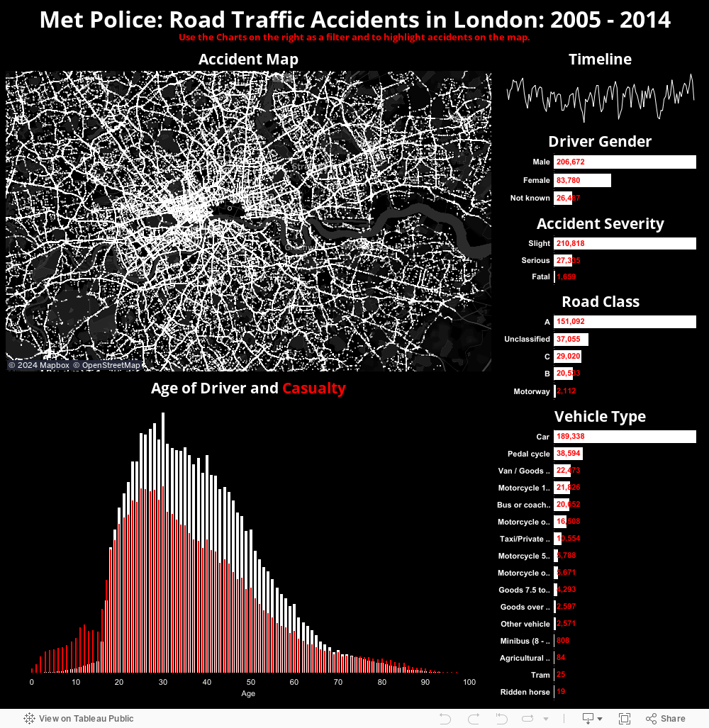
For that reason you really need to filter it down to stop everything grinding to a halt (though this sounds like a future challenge potentially). So, I took the most instantly recognisable city in Europe, maybe the world, and plotted all RTAs within the Metropolitan Police jurisdiction. Note City of London is empty. I assure you, cars can crash there, it's just they have their own separate police force.
Anyway, to the viz!
For that reason you really need to filter it down to stop everything grinding to a halt (though this sounds like a future challenge potentially). So, I took the most instantly recognisable city in Europe, maybe the world, and plotted all RTAs within the Metropolitan Police jurisdiction. Note City of London is empty. I assure you, cars can crash there, it's just they have their own separate police force.
Anyway, to the viz!
Tuesday, 27 October 2015
Road Traffic Accidents in London: 2005 - 2014
Was having a little play around with Alteryx and Tableau, giving a demo with Public Data and created this map of Road Traffic Accidents attended to by the Metropolitan Police. Thought this image was well worth a share.

Tuesday, 29 September 2015
Major Earthquakes of the 21st Century
It's been a couple of weeks since my last post, and I've decided to move away from Football, albeit temporarily, and back over to Wikipedia based data. We all know there's a wealth of information there, but there's also a wealth of Data contained within their pages too. This example looks at Major Earthquakes of the 21st Century, though I'm thinking I might expand that out later to cover the 20th Century too.
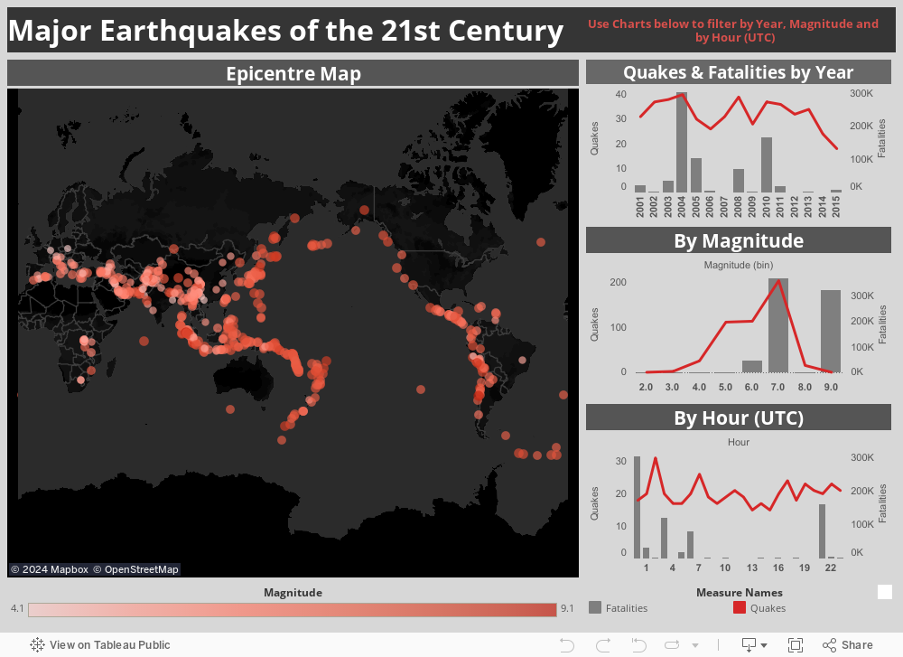
The visual is of course fully interactive, and I think it actually looks pretty smart and uncluttered. All feedback is welcome of course.
Data originally found here:
Wednesday, 26 August 2015
Shooting for the Stars (But Missing Quite Often)
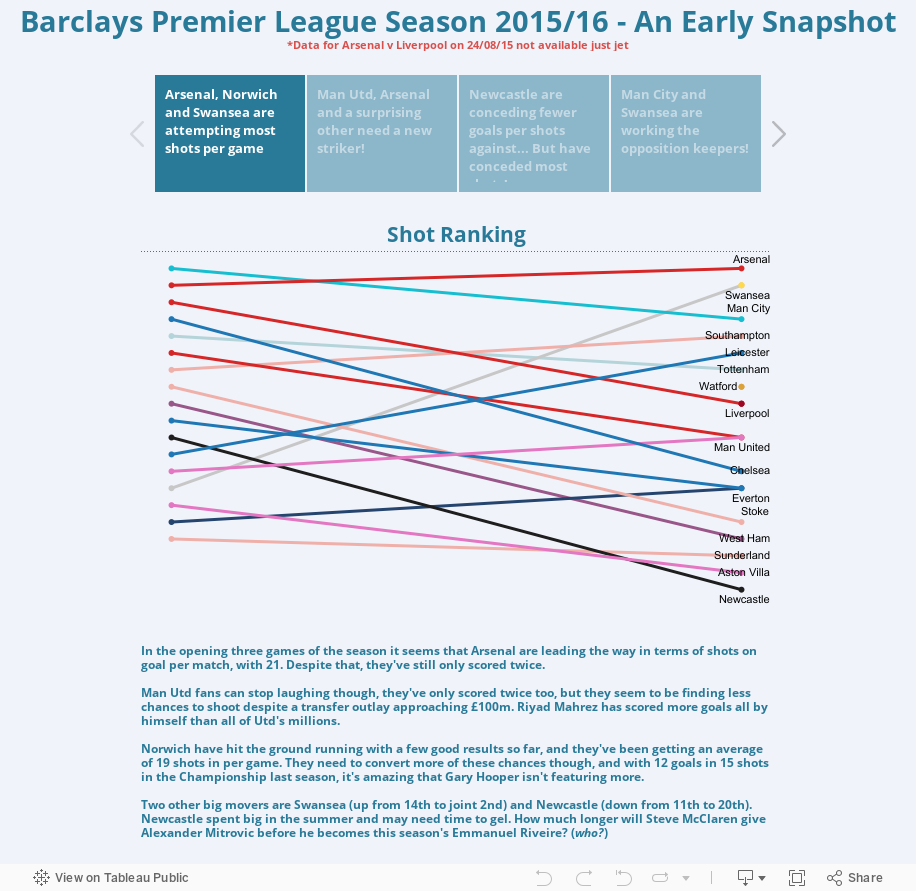
You may have noticed that this has become a bit of a Football stats blog of late, but with the new season just three games old, a whole plethora of data available and some new toys to play with, I think it'd be rude not to!
The latest dataset comes courtesy of www.football-data.co.uk, it's a relatively straightforward set of data containing standard high level data on matches played so far this season. The format it's in doesn't really lend itself to much analysis though, so my favourite new toy - Alteryx - helps me prep the data in ridiculously quick time.
The raw data gives one row per match, dividing the team data into 'Home' and 'Away'. So if I want to aggregate all data relating to Chelsea, it becomes a bit difficult, as they essential have two fields for each statistic, as well as two fields for their actual name. Using Alteryx I split out the 'Home' and 'Away' team data, cleaned it up, renamed the headers to match and used the Union tool to append the 'Away' data to to the end of the 'Home' data. The finished workflow is remarkably simple:

I'm bringing the data in, using the Record ID tool to assign each match a unique ID, using the Select tool to pick up the 'Home' fields only, and another for the 'Away' fields where they are renamed to match, then using the Union tool to put them back together again, using two Formula tools I'm adding a new field called 'Season' and with the second I'm setting up a field called Result and populating it before outputting the data. Easy.
All I needed to do now was import it into Tableau Public and see what I could find:
The latest dataset comes courtesy of www.football-data.co.uk, it's a relatively straightforward set of data containing standard high level data on matches played so far this season. The format it's in doesn't really lend itself to much analysis though, so my favourite new toy - Alteryx - helps me prep the data in ridiculously quick time.
The raw data gives one row per match, dividing the team data into 'Home' and 'Away'. So if I want to aggregate all data relating to Chelsea, it becomes a bit difficult, as they essential have two fields for each statistic, as well as two fields for their actual name. Using Alteryx I split out the 'Home' and 'Away' team data, cleaned it up, renamed the headers to match and used the Union tool to append the 'Away' data to to the end of the 'Home' data. The finished workflow is remarkably simple:

I'm bringing the data in, using the Record ID tool to assign each match a unique ID, using the Select tool to pick up the 'Home' fields only, and another for the 'Away' fields where they are renamed to match, then using the Union tool to put them back together again, using two Formula tools I'm adding a new field called 'Season' and with the second I'm setting up a field called Result and populating it before outputting the data. Easy.
All I needed to do now was import it into Tableau Public and see what I could find:
Thursday, 20 August 2015
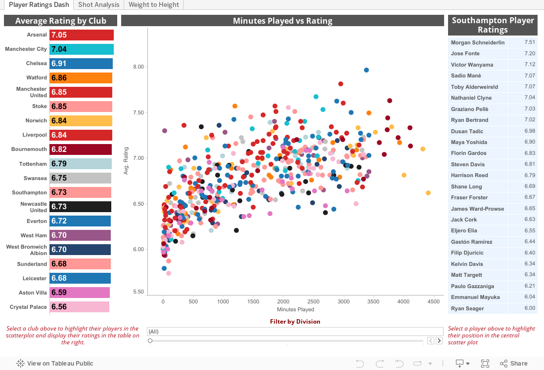
My First Webscrape - Premier League Player Ratings 2014/15
A couple of things led to the creation of this visualisation - a couple of colleagues and I are attempting to build models predicting the outcome of every Premier League match this season, with varying degrees of success, and secondly I saw Chris Love's awesome scrape of the BBC live text data. That got me thinking, if that complete mess of data can be scraped, anything can.
At first I tried to use the Alteryx Download and JSON Parse tools in a similar way to Carl at The Information Lab, but I'm a complete novice and couldn't get it to work. Definitely running before I can walk. But fortunately enough, I stumbled upon Data School student Hashu Shenkar's post on using Import.io in conjunction with Alteryx. I'd used Import.io before, but wasn't really aware just how powerful it could be - Hashu's post opened my eyes to what it could do.
I wanted to scrape Whoscored.com's Player Summary data, club-by-club for last season, for clubs who are currently in the Premier League (so we exclude QPR, Hull & the other one who got relegated) and include Norwich, Watford and Bournemouth's Championship stats (you can highlight and filter their data if you are against comparing apples with pears). I soon realised that WhoScored isn't the easiest to scrape from, but managed to get the Summary data, after about 8 attempts - for reasons unbeknown to me, when I published my API and ran my block list of 20 URLs through it, some would fail. I then had an issue where the API was skipping over players who were transferred out, such as Christian Benteke.
Anyway, data all downloaded I put it into Alteryx to clean it up, get rid of repeated fields, weird characters and organise it ready for Tableau. I'm currently evaluating Alteryx for a couple of weeks so I thought what better way to ease myself into it? The raw data scraped using Importio included Player Position data (as you'll see in the viz) in this kind of format: AM(RLC), FW. So I created a workflow in Alteryx to break that down into Individual positions: AMR, AML, AMC and FW with one row per player per position.
Once that was done, I had two csv files ready for Tableau Public!
Within this data there's a lot of insight to be gained, all sorts of interesting little stats hidden away and patterns emerge pretty quickly. I particularly enjoy how Chelsea's players are split in to two clusters, rating-wise, probably the only team aside from AFC Bournemouth, who have a clearly defined starting 11 with minimal rotation. That served them well last season, but with the increased competition in the PL and the step up for Bournemouth, is it unrealistic to expect that same approach to work for both teams this season? No doubt we'll find out.
One final point, WhoScored also have separate tabs (Javascript I believe) for offensive, defensive and passing statistics, but try as I may, I couldn't get import.io to scrape from those - any tips on how to do that would be most welcome. Enjoy the viz, was great fun making it from start to finish.
As usual, everything is interactive so click away and see what you can find. On the second tab, I've picked out some stats that caught my attention.
At first I tried to use the Alteryx Download and JSON Parse tools in a similar way to Carl at The Information Lab, but I'm a complete novice and couldn't get it to work. Definitely running before I can walk. But fortunately enough, I stumbled upon Data School student Hashu Shenkar's post on using Import.io in conjunction with Alteryx. I'd used Import.io before, but wasn't really aware just how powerful it could be - Hashu's post opened my eyes to what it could do.
I wanted to scrape Whoscored.com's Player Summary data, club-by-club for last season, for clubs who are currently in the Premier League (so we exclude QPR, Hull & the other one who got relegated) and include Norwich, Watford and Bournemouth's Championship stats (you can highlight and filter their data if you are against comparing apples with pears). I soon realised that WhoScored isn't the easiest to scrape from, but managed to get the Summary data, after about 8 attempts - for reasons unbeknown to me, when I published my API and ran my block list of 20 URLs through it, some would fail. I then had an issue where the API was skipping over players who were transferred out, such as Christian Benteke.
Anyway, data all downloaded I put it into Alteryx to clean it up, get rid of repeated fields, weird characters and organise it ready for Tableau. I'm currently evaluating Alteryx for a couple of weeks so I thought what better way to ease myself into it? The raw data scraped using Importio included Player Position data (as you'll see in the viz) in this kind of format: AM(RLC), FW. So I created a workflow in Alteryx to break that down into Individual positions: AMR, AML, AMC and FW with one row per player per position.
Once that was done, I had two csv files ready for Tableau Public!
Within this data there's a lot of insight to be gained, all sorts of interesting little stats hidden away and patterns emerge pretty quickly. I particularly enjoy how Chelsea's players are split in to two clusters, rating-wise, probably the only team aside from AFC Bournemouth, who have a clearly defined starting 11 with minimal rotation. That served them well last season, but with the increased competition in the PL and the step up for Bournemouth, is it unrealistic to expect that same approach to work for both teams this season? No doubt we'll find out.
One final point, WhoScored also have separate tabs (Javascript I believe) for offensive, defensive and passing statistics, but try as I may, I couldn't get import.io to scrape from those - any tips on how to do that would be most welcome. Enjoy the viz, was great fun making it from start to finish.
As usual, everything is interactive so click away and see what you can find. On the second tab, I've picked out some stats that caught my attention.
Tuesday, 4 August 2015
Barclays Premier League Stats - Chelsea Deserved the Title Last Season
With the new Barclays Premier League just around the corner, a few people at my workplace have challenged ourselves to build and develop a model to predict Premier League scores and results each weekend. The models are allowed to change as often as we like, the only rule as such is we are not allowed to use 'Gut Feel' - only data. It should be an interesting challenge for us, and one that hopefully will see us learn some new data geekery over the course of 9 months.
So naturally we found some pretty interesting datasets on our quests to build our models, not least from football-data.co.uk, which I have made an attempt to visualise below. It's obviously not in Tableau-friendly format, so I've had to rework it a bit. There were some really interesting insights within the data, that should lead some EPL fans to worry about their team's prospects.
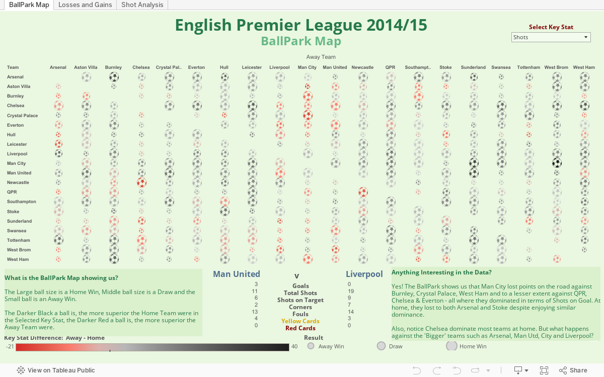
The name of the game is to score lots and concede few, something that Chelsea seemed to get down to an art form, grinding out boring victories towards the latter end of the season, it's fascinating to see the data reflecting that.
My favourite stat hidden in the data is this: 1 in every 7 shots against Newcastle is a goal, whilst 1 in every 13 against Chelsea is a goal.
Here's the visual, enjoy!
So naturally we found some pretty interesting datasets on our quests to build our models, not least from football-data.co.uk, which I have made an attempt to visualise below. It's obviously not in Tableau-friendly format, so I've had to rework it a bit. There were some really interesting insights within the data, that should lead some EPL fans to worry about their team's prospects.
The name of the game is to score lots and concede few, something that Chelsea seemed to get down to an art form, grinding out boring victories towards the latter end of the season, it's fascinating to see the data reflecting that.
My favourite stat hidden in the data is this: 1 in every 7 shots against Newcastle is a goal, whilst 1 in every 13 against Chelsea is a goal.
Here's the visual, enjoy!
Friday, 24 July 2015
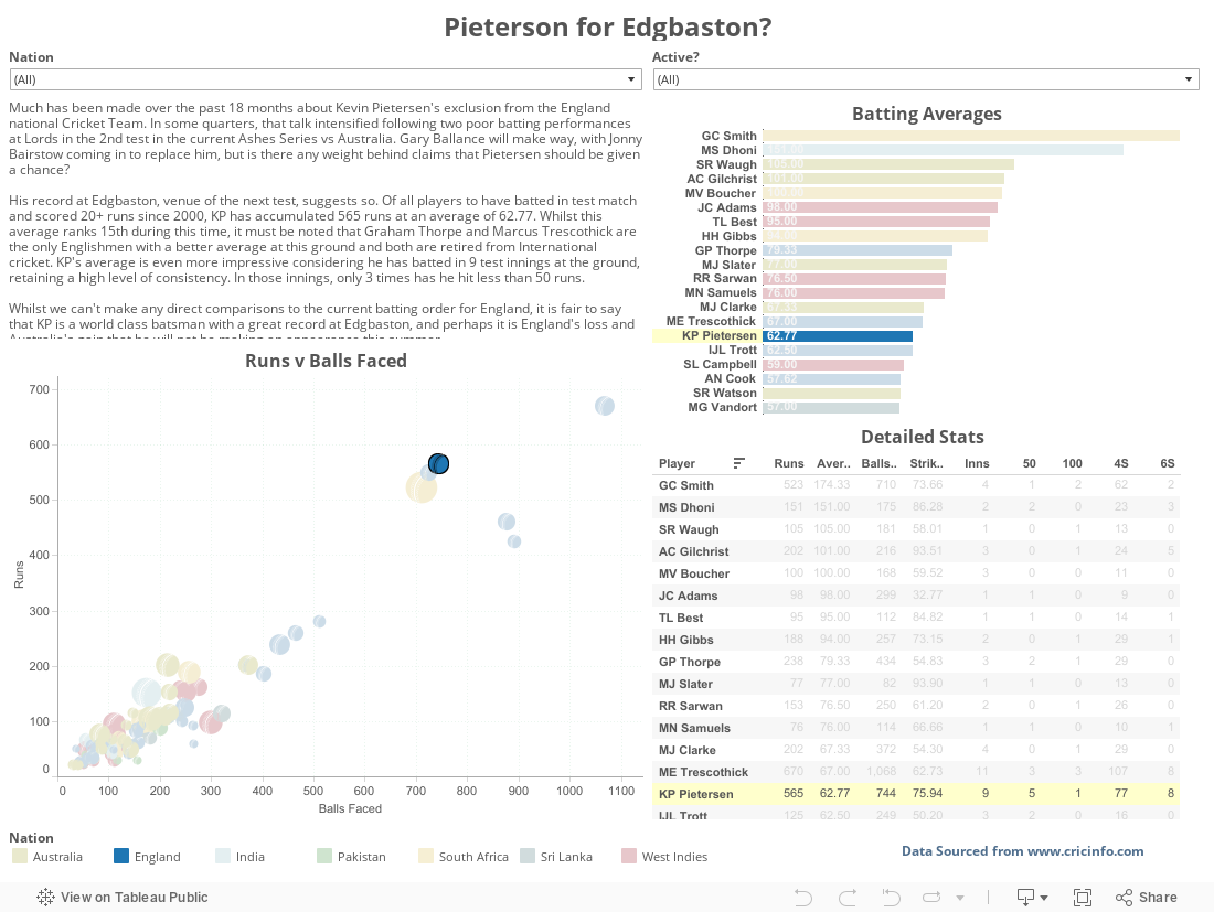
Pietersen for England?
The stats for Edgbaston over the past 15 years say that Kevin Pietersen should probably be playing against Australia in 5 days time. They also say that Alistair Cook and Ian Bell have decent records there too, and that Graham Smith was something of a phenomenon in the Black Country.
Thursday, 16 July 2015
Unfinished Viz-ness: The Gender Pay Gap
It has been a little while since my last foray into Tableau Public, April to be a little more specific, and I've actually changed jobs in that time. My new role has been quite a steep learning curve, so initially there wasn't really a great deal of time for Tableau - that's changing now, so expect a few more posts over the summer months.
I'll also be looking to start recording some of those nifty videos I've seen a few Tableau experts producing over the past year or so, offering my own tips and guidance for getting the most out of Tableau
In the meantime though, here is a topical viz looking at Gender Pay inequality across OECD nations. As is hinted at in the title, it's not fully complete - there is quite a bit of data to digest over on the OECD website, so I'm trying to digest it bit by bit and filter out some of the less interesting stuff. So far I've looked at Pay Gap Differences and 'Employed in Managerial Position' differences.
As always feel free to comment and make suggestions.

I'll also be looking to start recording some of those nifty videos I've seen a few Tableau experts producing over the past year or so, offering my own tips and guidance for getting the most out of Tableau
In the meantime though, here is a topical viz looking at Gender Pay inequality across OECD nations. As is hinted at in the title, it's not fully complete - there is quite a bit of data to digest over on the OECD website, so I'm trying to digest it bit by bit and filter out some of the less interesting stuff. So far I've looked at Pay Gap Differences and 'Employed in Managerial Position' differences.
As always feel free to comment and make suggestions.
Sunday, 5 April 2015
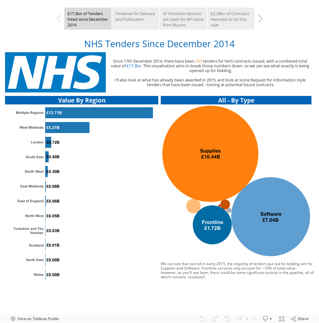
NHS Tenders in 2015
It's a beautiful Easter Sunday Afternoon, so what have I been doing? Working up a Tableau storm in my sun-drenched back garden, of course!
I pulled some data from https://www.contractsfinder.service.gov.uk/ looking in particular at any contracts put out for NHS related services. It turns out there are quite a lot, so handily enough the site allows you to download into CSV or XML format.
Once downloaded I had a root through each contract description to understand whether this is directly affecting Frontline services or whether it's something else (such as supplies, premises, management etc.)
I encourage you to play around with this interactive storyboard viz, as there's all sorts of interesting things happening.
Underneath this one is the original version I created in June 2014, but it seems the old evidence links have failed with the Government's change of website. From June 2014 to December 2014, I found it difficult to get hold of anything usable to cover the gap. If anyone is able to help on that, give me a shout!
As Promised, 2014's version (only contains Frontline services)

I pulled some data from https://www.contractsfinder.service.gov.uk/ looking in particular at any contracts put out for NHS related services. It turns out there are quite a lot, so handily enough the site allows you to download into CSV or XML format.
Once downloaded I had a root through each contract description to understand whether this is directly affecting Frontline services or whether it's something else (such as supplies, premises, management etc.)
I encourage you to play around with this interactive storyboard viz, as there's all sorts of interesting things happening.
Underneath this one is the original version I created in June 2014, but it seems the old evidence links have failed with the Government's change of website. From June 2014 to December 2014, I found it difficult to get hold of anything usable to cover the gap. If anyone is able to help on that, give me a shout!
As Promised, 2014's version (only contains Frontline services)
Thursday, 19 March 2015
Iron Viz Entry: Wikipedia Dataset - Nobel Peace Prize Laureates
Click the image below for my Iron Viz Entry!

Tuesday, 24 February 2015
30 Minute DataViz
Thought I'd set myself a mini-challenge:
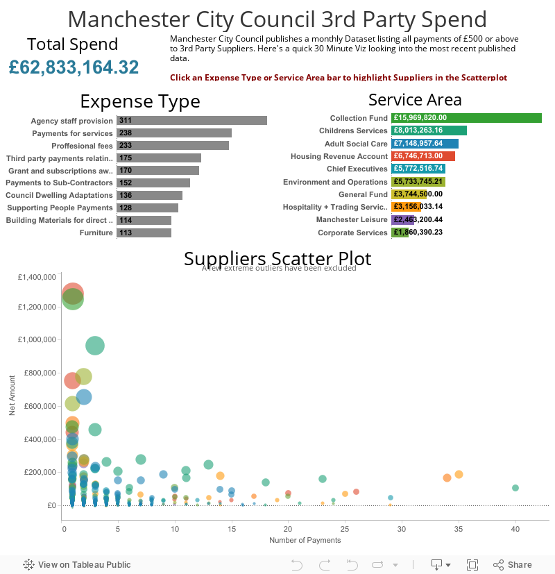
30 minutes to find some data, format it (if necessary), plug it in to Tableau, create a Viz and publish it. Think I did a reasonable job with this, admittedly limited, dataset. It would be fascinating to add in the data from 2011 (as far back as data goes), but that would have required downloading 30+ CSV files and merging them into one - eating up valuable viz time!
What'd be even more fascinating is to expand the dataset to include other councils from the Greater Manchester area and beyond.
Consider this: Manchester City Council spends £62.8m on £500+ payments to 3rd Party Suppliers in this one month, that's probably about £730m per annum (assuming October to be an average month). That's just one council. There are 434 Councils in the UK.
One for next time maybe ;)
Final note: The Scatterplot does something a little interesting (that I never thought could be done). Hint - select one of the circles to see what happens!
Consider this: Manchester City Council spends £62.8m on £500+ payments to 3rd Party Suppliers in this one month, that's probably about £730m per annum (assuming October to be an average month). That's just one council. There are 434 Councils in the UK.
One for next time maybe ;)
Final note: The Scatterplot does something a little interesting (that I never thought could be done). Hint - select one of the circles to see what happens!
Friday, 6 February 2015
The Viewing Figures Visualisation
Inspired by DataJedi.ninja's fantastic 'Previously on 24' viz from last year, I thought I'd take a look at The Big Bang Theory following on from the stars of the showing reportedly earning themselves a $2m paycheck per episode - not bad work, if you can get it!
The Viz below shows how the viewing figures have changed over time, from the lows of Series 1 through the highs of Series 6 and 7. Enjoy :)
Also noticed this viz really shows off the new and improved tooltip functionality - much slicker transitions whilst hovering...

The Viz below shows how the viewing figures have changed over time, from the lows of Series 1 through the highs of Series 6 and 7. Enjoy :)
Also noticed this viz really shows off the new and improved tooltip functionality - much slicker transitions whilst hovering...
Thursday, 22 January 2015
UK Road Accidents v3 - The Horizontal Scroll!
A few months back I started up a little bit of a project with a pretty hefty data set on the data.gov.uk site. The data relates to all recorded Road Traffic Accidents in Mainland Britain from 2005 to 2013. That's a heck of a lot of records, and Tableau Public 'only' allows for 1 Million. I decided to go from 2010 onwards to get a smaller, yet sizeable sample of data to experiment with Tableau Public and push some (of my) limits.
I hadn't really looked at it for a while until I saw a bit of a Twitter exchange between two immensely talented Vizzers (is that the right word?):
Anyways, less fluff, more viz:

I hadn't really looked at it for a while until I saw a bit of a Twitter exchange between two immensely talented Vizzers (is that the right word?):
@WarOnWar I loved the way @VizCandy built her scrolling Viz, it felt cleaner than story points IMO
— Chris Love (@ChrisLuv) January 16, 2015
And that set me thinking half jokingly about scrolling the other way. The next tweet sealed the deal for me though:
@WarOnWar I look forward to seeing that on tablet!
— Kelly Martin (@VizCandy) January 17, 2015
Now I had the image of the user scrolling through a viz by swiping across - and that brought me back to the Road Traffic dataset, perfect! The viz is below, decided against restricting the Tableau embed width as you need to go off screen to scroll otherwise.Anyways, less fluff, more viz:
Sunday, 4 January 2015
Tableau Tips: Tiled or Floating?
So, you've managed to get all the difficult stuff out of the way. You've found some interesting data, you've formatted it in such a way that Tableau can read it, you've created some pretty cool looking worksheets. The final piece of the Viz Puzzle is of course the all important dashboard.
If you're relatively new to Tableau, the dashboarding aspect can be a little bit daunting. Not because it's difficult - Tableau make it pretty easy actually - but because there are just so many ways in which you can lay out those sheets you've spent a great deal of time working on. One thing that struck me a couple of weeks back was the Tiled and Floating options available:

A colleague who is fairly new to Tableau was looking at a few dashboards I'd produced and comparing them to some of his own. He was having issues fitting everything he wanted into his dashes and was unaware of the Tiled and Floating options and how both can help the user structure their dashboards. I'll give a bit of an overview as to what these can do for you over the next few posts, however it's always personal preference, the data itself and/or the requirements of the end user that will dictate which option you use.
Tiled
The Tiled option is very swift and straightforward, you can either double-click on the sheet name you wish to insert and Tableau will place it into the most logical place it sees in your workspace similar to that below:

That obviously looks pretty horrific, but with some tweaking it can be made to look a lot better. A pet hate of my own is that big space beneath the legend. If you go with the auto-layout, that space will only ever be filled with legends and filter menus. If you don't have many, it ends up being a waste of space that cramps up your dashboard.
My preference though with the Tiled option is to click and drag the sheets to the exact space that I want them. Doing this gives you a little more control over where everything goes, with the following result:

Next time up, I'll look at the Floating option, which is the one I generally use, as it gives me a lot more control over what goes where. In the meantime though, I'll leave you with my quick Viz on the career of one of the Football's true greats: Ferenc Puskas, the Magic Magyar. Just take a look at the Average Goals Per Game over the course of his career, staggering! Though I'm sure Messi and Ronaldo will at least compete on that front:

Subscribe to:
Posts (Atom)